Serenity
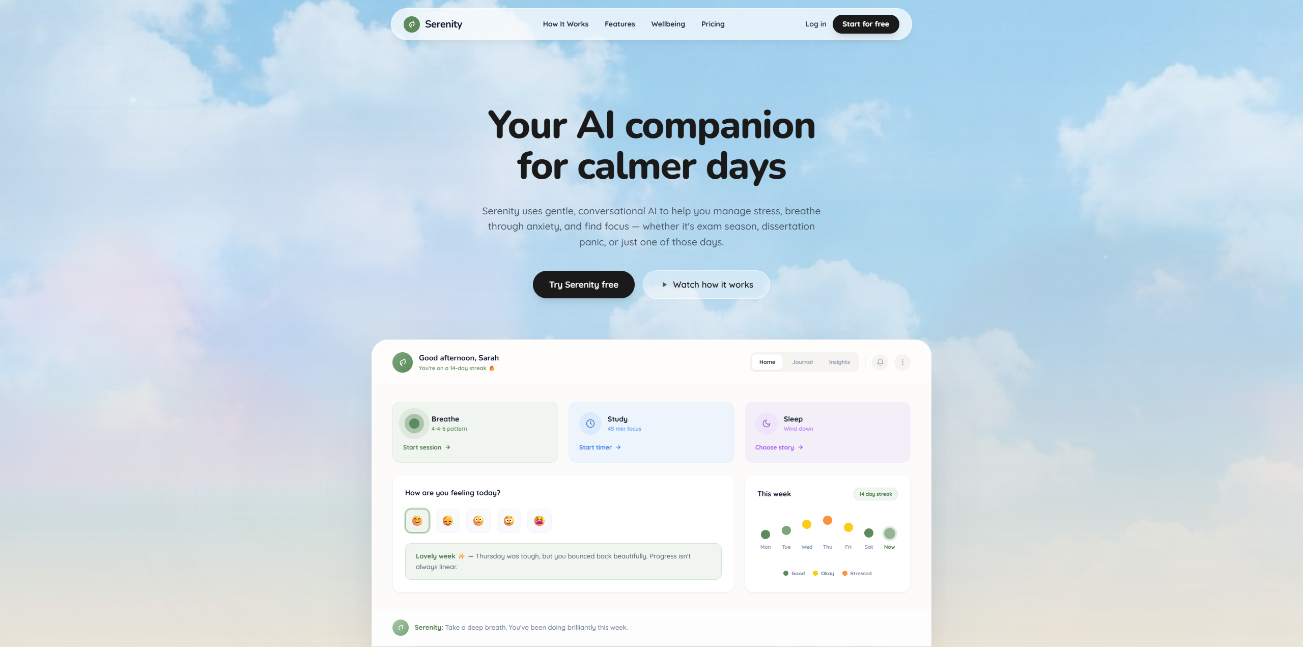
A hero section concept for a wellness AI companion. Soft sky gradients, warm serif typography, and a product preview that feels like a deep breath.
Most mental health apps feel clinical. Cold interfaces, sterile colors, and medical language push people away before they even try the product. Serenity needed to feel like a friend, not a prescription.
We led with emotion over features. A dreamy sky photograph, warm serif headline, and a peek at the app dashboard let the design speak before the user reads a single word. The muted green palette and soft cloud imagery reinforce the calming promise of the product.
Warmth before features
The sky gradient, soft clouds, and serif headline do the heavy lifting before the user reads a single word. Below, the app mockup previews mood tracking, breathing exercises, and AI encouragement without overwhelming. Every element says: this is a safe space.