ChatGPT Atlas Redesign
A concept redesign of ChatGPT. We rethought the conversational AI experience with a cleaner layout, smarter search, and a UI that puts users in control.
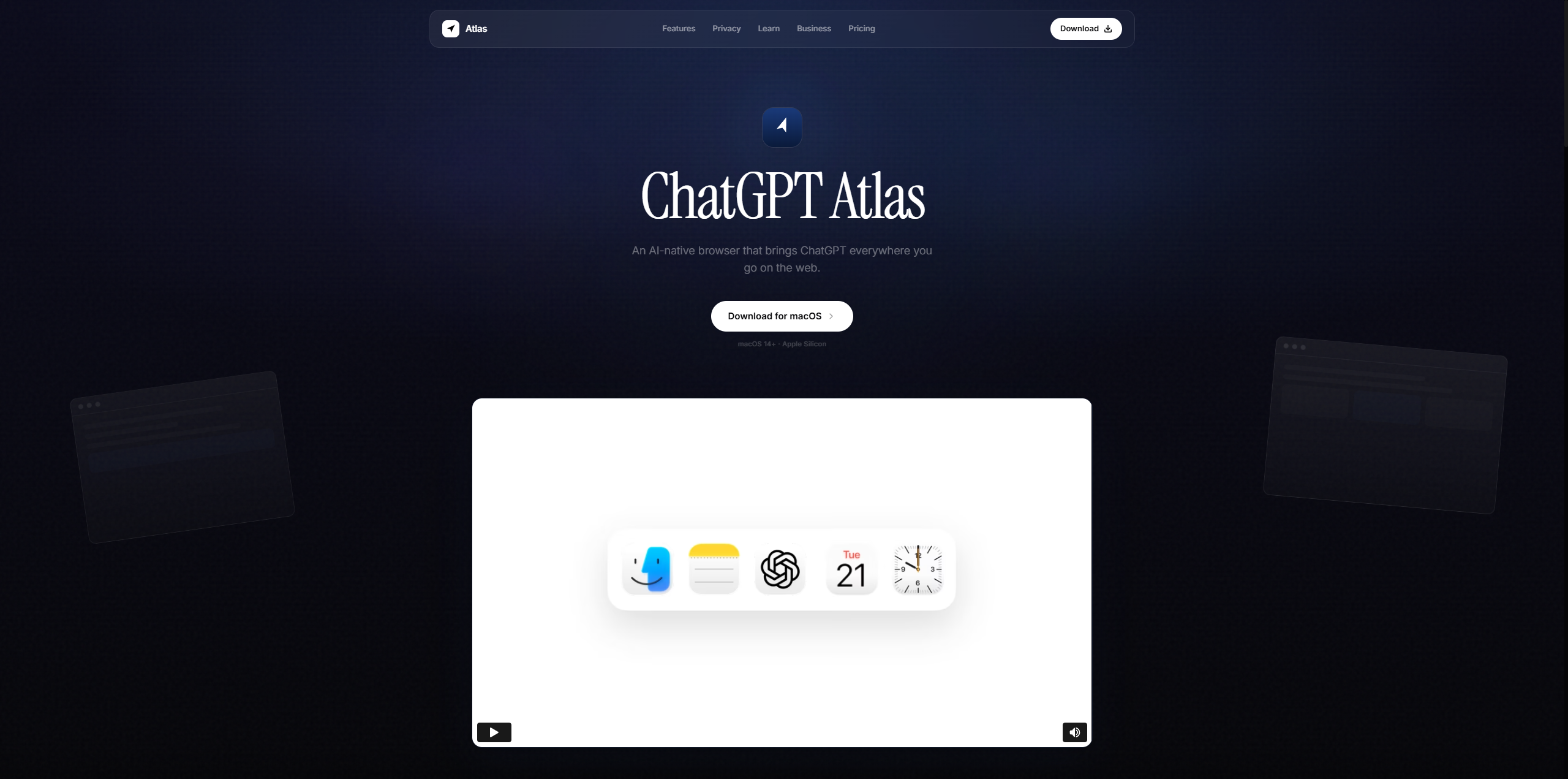
ChatGPT felt like a tool you visit, not something that stays with you. We wanted to change that. Atlas is a concept for a native desktop browser where ChatGPT is always there, quietly helping as you browse, search, and work.
We started by watching how people actually browse. The goal was to make ChatGPT feel like part of the browser itself, not something added on top. Every design choice came down to one question: does this make things simpler or more complicated?
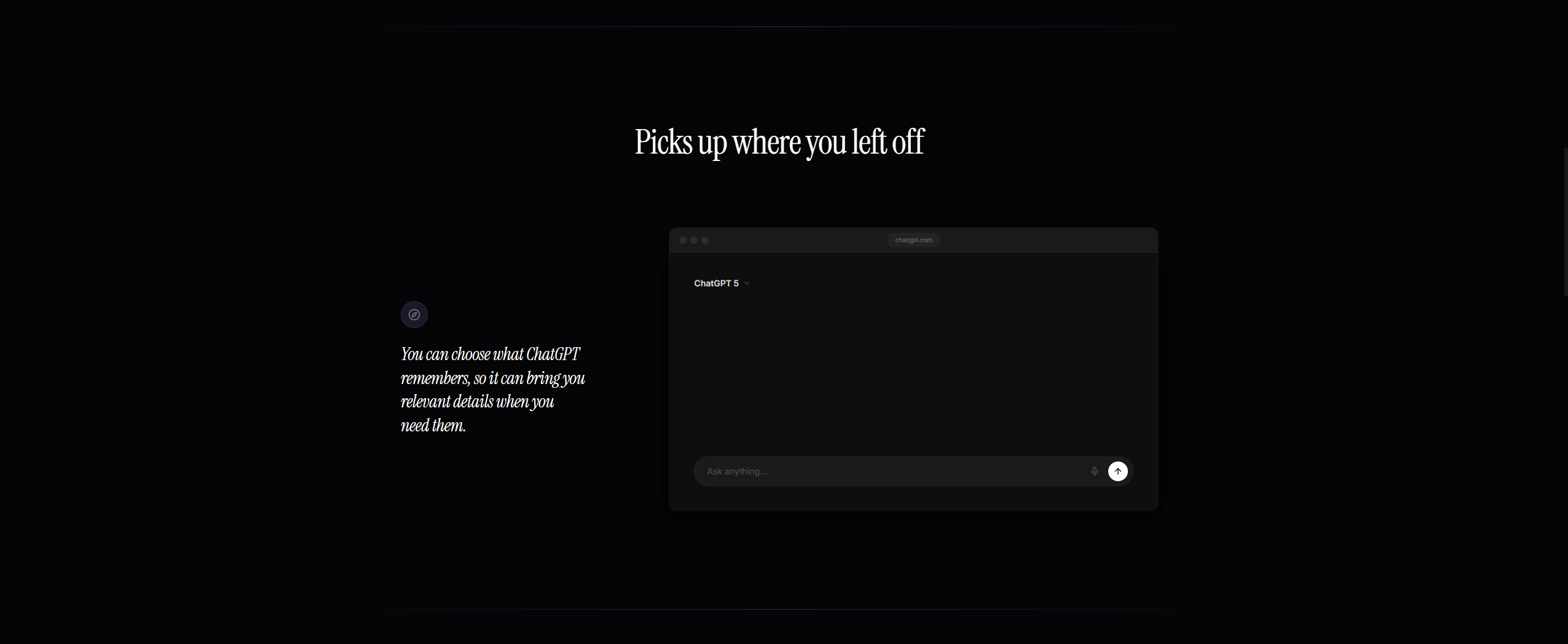
Pick up right where you left off
The memory system works like a great assistant. It remembers what matters so you never have to repeat yourself. Context lives on the left, conversation on the right. Coming back to a chat feels like opening a saved bookmark.
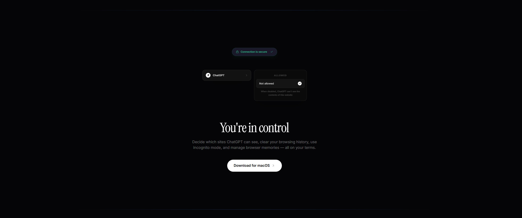
You are always in control
Letting AI see your browsing data is a big ask. So we made privacy the default. A visible security badge, per-site permissions, and one toggle to shut it all off. When people feel safe, they actually use the product.
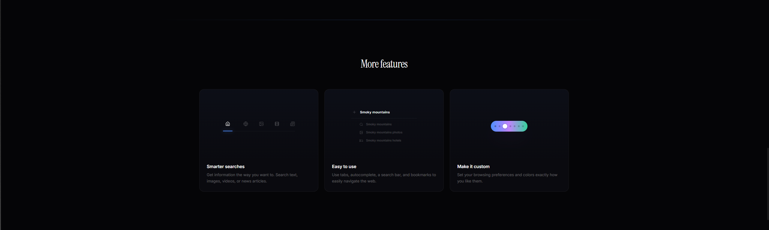
Smarter search. Full customization.
No marketing fluff. Each feature card shows a real piece of the interface. Intelligent autocomplete, tab navigation across content types, and a color picker for themes. Specificity builds trust faster than words.
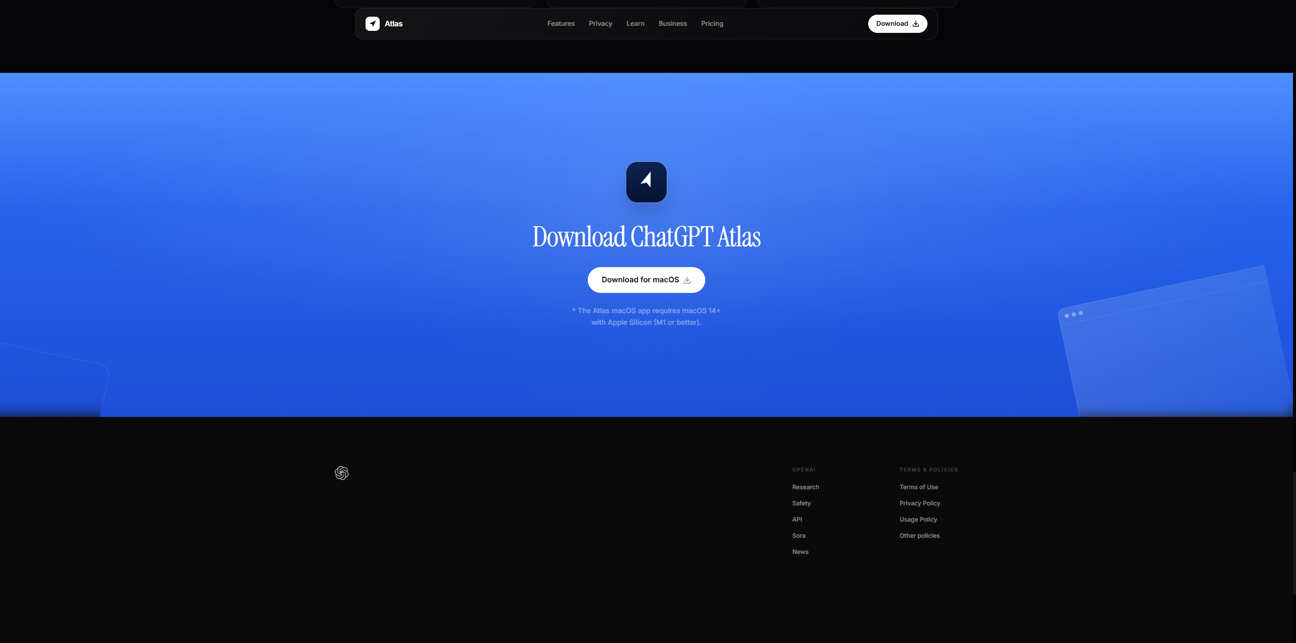
One clear moment to act
The whole page stays dark and restrained. Then it breaks into a bold blue gradient for the download button. That shift is intentional. After earning attention quietly, the color change says: time to act.