Fuugly
App icon design for a student finance app. A friendly blue blob mascot that makes budgeting feel less like homework and more like a friend helping out.

Finance apps scare students. The interfaces are cold, the language is confusing, and the icons all look the same. Fuugly needed an app icon that students would actually want on their home screen. Something that says "money stuff" without looking like a bank.
We designed a mascot first, icon second. The blue blob character is soft, round, and impossible to take too seriously. He holds a gold coin with a pie chart on it so you know what the app does without reading a single word. We created two variants: the base mascot for marketing and a glasses wearing version for the app store that gives him a studious personality. Thick outlines, flat color, and a cream background keep it legible at any size.
The character before the icon
This is the raw mascot before any app store formatting. No glasses, no rounded square. Just a friendly blue blob with big eyes and a gold coin. We designed the character to work on its own first because a good icon starts with a good character. If it works at this stage, it works everywhere.

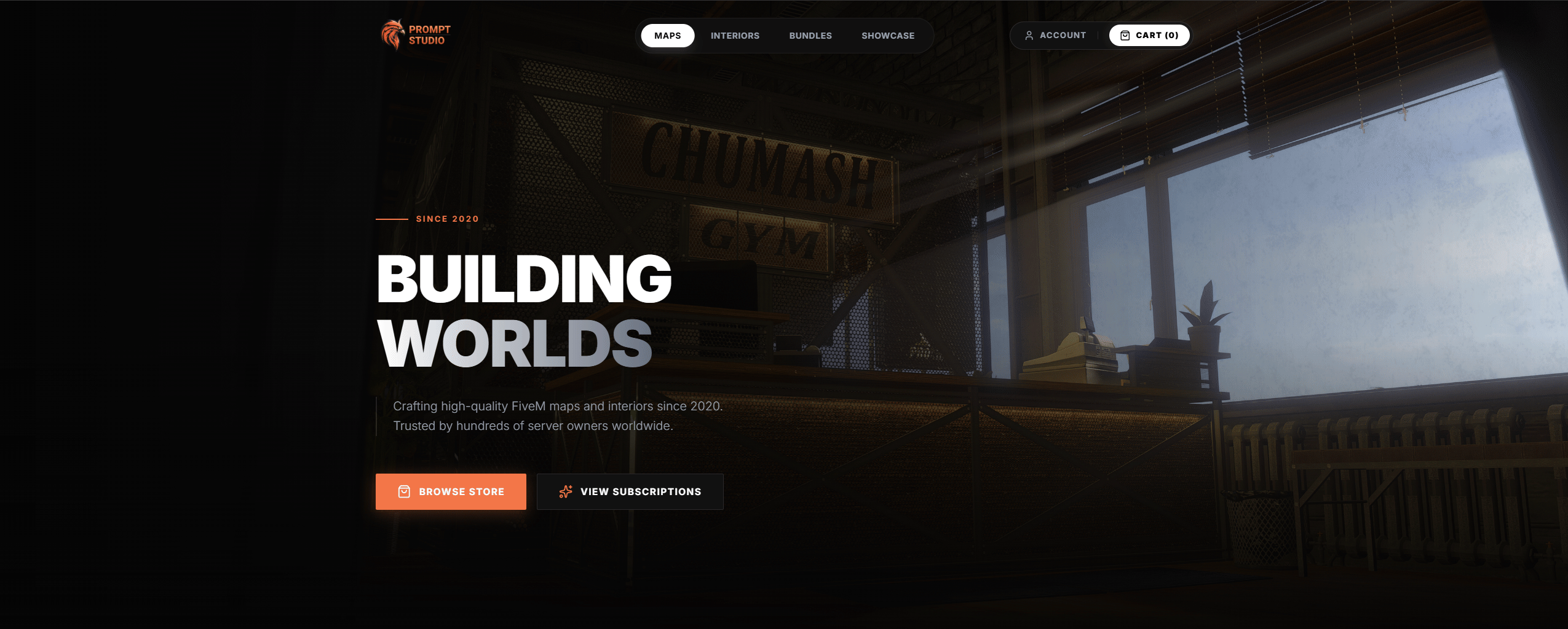
Smart enough for the app store
Same character, add glasses, and suddenly he looks like he knows what a budget is. The warm cream background and soft rounded square give it the app store framing while the glasses add just enough "I handle your money" credibility. The thick outlines keep it sharp at 60 pixels on a home screen.